There is a slight change in Cascades 10.3 dealing with conditional variables based off of the length of the hint text of a field. For example the following code (designed to only show the TextField when the hint text is not an empty string) would work on BlackBerry 10.2 but fails when run on BlackBerry 10.3
Fortunately the work around for this is extremely simple. You just need to create (and set) an additional alias for the visibility of the field. This is shown below…
Container
{
property alias hint:newTextField.hintText
property alias text:lbl.text
property alias showTextField:newTextField.visible
Label
{
id:lbl
multiline:true
}
TextField
{
id:newTextField
}
}
I have made claims about my Erie Canal app being the first BlackBerry app to make use of the Ionic framework, so it should be worth pointing out how this was done. Technically the Ionic framework only support iOS and Android, but it is based off of Cordova just like BlackBerry’s Webworks framework is. Knowing how well BlackBerry 10 supports HTML5 I assumed that it was likely that supporting this new framework would be no trouble at all.
Using either BlackBerry Webworks or the Ionic Framework require quite a bit of set up involving the installation of Node.js and Cordova but once everything is set up, the process is fairly simple. First create two separate instances of your new project, one with the Ionic framework, and one with BlackBerry webworks. Then copy over the www/lib folder from the Ionic project to the BlackBerry project. This folder includes all of the css and javascript that make up the Ionic framework (and also includes the libraries needed to support angular.js). Once this folder is included, BlackBerry HTML5 apps can be compiled as normal.
In fact the entire www folder can be shared between BlackBerry, Android, and iOS versions of the app with the platform differences mostly taking place in manifest files and the actual compilation of the apps.
While BlackBerry claims that this will work flawlessly and magically, that is not exactly the case. Downscalling content such as this has some issues, mainly that any UI elements that are only a single pixel wide have a one in four chance of disappearing completely. Scaling can work, but it is best when you are scaling up and are doing so by a power of two. This is why iOS devices doubled their horizontal and vertical resolutions when they switched to a higher res format.
In fact, any element with a size less than 4 pixels has the possibility of looking to be a bit off. The images below show the result of scaling a 1×1 pixel grid (in pink), a 2×2 pixel grid (in blue), and a 4×4 pixel grid (in orange).
Grids are kindof a worst case scenario, so most apps actually won’t look too bad. But nothing is going to look great.
What is worse is that the device really believes itself to be a different resolution than it is. As such developers have no simulator, and screenshots are the same 720×1280 resolution that the Z30 produces. This also implies that all text (which is full of the thin strokes that are susceptible to issues) also goes through this identical scaling process.
At $190 the BlackBerry Z3 is not significantly cheaper than the Z10, so there is no reason that this should be your smartphone of choice. Pay a little extra and get something better.
The following batch file takes a Cordova project and builds, signs, and deploys a .apk file. I had found this script to be helpful for myself, so hopefully it will help others as well. Just replace keystore_file and alias_name with your own keystore information.
cordova build --release android
for /f "delims=" %%x in ('dir /od /a-d /b platforms\android\ant-build\*.apk') do set recent=%%x
set recentShort=%recent:-release-unsigned.apk=.apk%
Nokia has just announced their new X line of phones that run a skinned version of Android. In their announcement, Nokia boasted that 75% of existing Android apps were already compatible. However, instead of being impressed, my gut instinct was that the number seemed rather low…
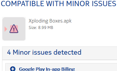
A run through the compatibility checker confirmed my fears. Of the five android apps I am currently selling through Google Play, only one had no compatibility issues. Most of the problems with the apps centered around support for in-app billing (there are also issues with supporting any mapping APIs). While the tool regards this as a minor issue, the ability to make money from apps is kind of important (and due to my use of the AIR framework also tricky to fix).
The billing API is mostly a drop-in replacement for Google’s, but I feel that it would be easier if Nokia took a page from BlackBerry’s book and allowed the apps to integrate with its store without any code changes at all. Amazon does a similar thing to Nokia in forcing developers to rework their apps, but in exchange at least promises a unique and sizable market. Meanwhile, Nokia’s X phones live under the threat of being axed by Microsoft before we even reach summer.
It can be rather impressive to see how much the efficiency of your code can improve as you get to know a platform better. When it comes to writing BlackBerry 10 apps in Cascades my code has gotten dramatically better. This is not the result of any special magic, but instead a by product of putting in the required hours for a given platform. For example my Mileage Tracker app has recently been updated to version 1.5 and despite continuing to add new features in each new version, the size of the .bar file is as small as it has ever been. To look at the overall sizes of the .bar file for the Mileage Tracker app see the below chart.
Despite the fact that it looks terrible, Windows Phone offers users the ability to place their phones into a light theme. For any app that applies a specific color or background anywhere, testing against this theme is a critical step before submitting a new application, and is almost guaranteed to cause a few headaches.
While BlackBerry 10 allows you to force a dark theme for your app with a single line of XML, for Windows Phone you need to force individual components into a dark theme. For the most part this is done by remembering to explicitly set your background and foreground colors for every component, this can usually be done either in XAML or in C#. Below is an example of setting the colors for the ApplicationBar in C#.
Setting the SystemTray to a dark theme requires a bit a more unique approach, where you add attributes to the root element of the main PhoneApplicationPage in XAML. As seen in the following lines of code.
Also note that you can not set the SystemTray ForegroundColor to exactly white. It can be very close to white such as a very light gray, or the FloralWhite that I used, but it can not be exactly white. While the small print of Microsoft’s documentation is very clear on this, the reason why seems to be a complete mystery.
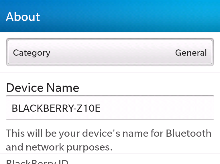
When using a script (or the command line) in order to deploy apps to a device you can use the phone’s device name (which seconds as a network name) in place of the ip address. For example instead of
This shortcut is particularly helpful to use when writting scripts, so you do not have to update the file every time that the phone is assigned a new ip address.
The UI that BlackBerry introduced on the PlayBook, and continued on BlackBerry 10 calls for the support of a swipe-down menu where a user can swipe down from the top bezel and gain access to additional options for the app. The design in very good in theory in that it allows a dedicated menu area without consuming any real estate on the screen or requiring a dedicated menu button. However, far too few apps make use of this menu for consumers to expect it to be there.
I have written about this problem before. Over two years ago I noticed this problem on the PlayBook and the issue has only gotten worse since then. The Cascades framework instead encourages the use of an overflow menu, and even less preinstalled apps make use of the swipe-down menu.
Major apps such as the Browser, Facebook, and the search app do not have a swipe-down menu at all. Many other first party apps such as the Pictures app, the Videos app, the Music app, and the File Manager make only trivial use of the swipe down menu offering nothing more than a link to an external help file. (Couldn’t BlackBerry at least open these help menus as a card?) Even more interesting is the Calculator app that had a swipe down menu when BlackBerry 10 first launched, but as of 10.1 no longer has one at all.
Following BlackBerry’s lead, many developers (including myself) stopped using swipe-down menus. Following the current UI guidelines for Cascades almost every app will have some sort of an action bar making it trivial for developers to just place everything else in the overflow menu where it is much more discoverable by users. At this point I honestly can not recommend that anyone rely on the swipe-down menu as the only way to do anything in their app.
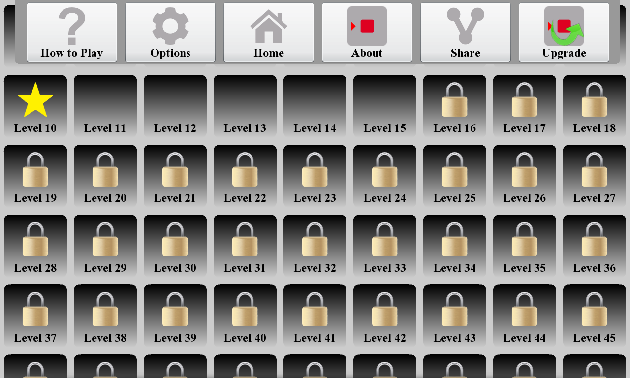
In version 5.1 of my Twinkle app (pictured) I am implementing a swipe-down menu in a Cascades app for the first time. Yet all three of the options there are redundant and are also available through the standard action bar overflow menu. At this time, this is the absolute most support that I am willing to give to the swipe-down menu. If BlackBerry wants this situation to change, they should seriously rethink their UI guidelines and what they are doing with their own apps…
The following batch script is what I use to automatically deploy the most recently created .bar file in a folder to either a PlayBook or BlackBerry 10 phone.
@echo off for /f "delims=" %%x in ('dir /od /a-d /b *.bar') do set recent=%%x @echo on call blackberry-deploy -installApp -launchApp -device <device-ip-address> -package %recent% -password <device-password>
Just replace <device-ip-address> and <device-password> with your actual ip address and password.
For Android apps compiled against Adobe AIR, it is best if you include the entire AIR runtime as part of your distributable .apk file. It may not be as nice from a programing standpoint, but it is far better for the end user. I have three Android apps in the Google Play store (Xploding Boxes, Runaway Trains, and Black Out), at first I relied upon users to download AIR for themselves, but have since realized that bundling the runtime gives a much better experience for Android users.
For developers the idea of having the AIR runtime as a separate installation presents a much prettier (and more loosely coupled) architecture. It allows the app to have a smaller file size, and to share the AIR platform with any other apps that need to make use of it, while also allowing the two installations to be updated individually.
However on Android (unlike the BlackBerry PlayBook and the Barnes and Noble Nook) the AIR framework is not preinstalled on the OS, so if the captive runtime is not used to bundle AIR into your .apk than when users first launch the app they are presented with a screen asking them to go download and instal Adobe AIR. This is just giving your users another chance to quit, and ignore your app, and even resulted in a poor review for one of my apps from a user who did not understand what Adobe AIR was.
Instead if you bundle AIR into your app using the captive runtime you result in a larger distributable file, but when the user goes to launch it for the first time it is guaranteed to just work.
Last week RIM announced project Zygote where they are improving the start up times of cascades apps by pre-compiling shared libraries. I gave it a go with some of my existing cascades projects and found significant improvements to the launch times of my apps.
On average these changes have eliminated 52.3% of the load times for these applications, making these changes well worth it. For details on how to implement this see instructions here and here.