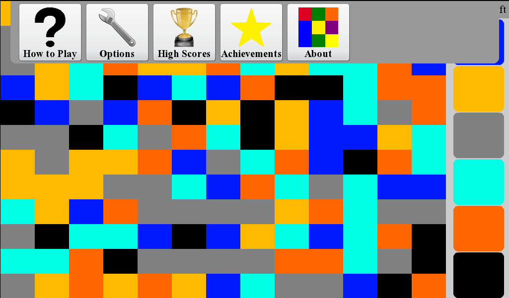
The bezel on the top of the PlayBook is reserved for developers to integrate a menu that can be swiped down from the top. However, an unfortunately large number of applications do not currently make use of this option. This breaks the consistency of the platform, and makes it more difficult for users to quickly get used to the tablet’s interface.
 If not enough apps make use of the swipe down menu, users will not expect it to exist, and for those applications that do use it, users are liable to be unaware of the menu’s existence, and any additional items that are located there. Furthermore the alternative is to place a menu button on the screen that takes up space, and prevents the app from feeling like a native application.
Currently of the top 10 free apps, only 3 (including Pixelated) support a swipe down menu. Furthermore RIM is not even including one in all of its own applications such as the Scrapbook App, or even BlackBerry AppWorld. Given all of the support that RIM has offered to EA for Need For Speed, you would think that it would implement this basic UI function, but instead this app ignores the top bezel, and uses a convoluted two finger swipe instead.
RIM does not appear particularly interested in promoting this swipe down menu, but should they change their mind, they could do so by requiring that an app make use of such a menu in order to be featured in AppWorld. If RIM were to do this, the number of apps implementing a menu would rather quickly hit critical mass, and in turn give users a more consistent, and predictable interface to navigate.