Controlling a phone with gestures

With the iPhone X launching this fall without a home button, many iOS users are going to have to get used to controlling their phones with just gestures. For those of us with a history on BlackBerry 10 we know how this works, and we are here to tell you that it is awesome.

Swipe up to home

Honestly this gesture is perfect. A simple swipe up to get back to the home screen is super intuitive, and as much as I enjoy the fingerprint reader, having to use a button on my iPhone still feels like a step backwards.

Swipe down for control center

Again this is straight out of the BlackBerry 10 interface and it works well. Honestly this isn’t much different than the current iOS approach, but moving to the top to have the more reachable swipe sending you home makes sense.

Lift to wake

This was added in BlackBerry 10.3.1 and while conceptually neat, I actually went and turned this off. Just reaching to place the phone in my pocket the screen would flash on and I found this to be too distracting, so I went without this function.

FaceID

BlackBerry didn’t have this one. Apple seems confident in their technology, and honestly it is going to make or break this design. If it can not match the speed of touch id then I probably won’t be getting the iPhone X.

BlackBerry Hub

Apple hasn’t shown off notification on the new phone, so I am going to keep the dream alive. Probably not going to ship with iOS 11. Still I think this is one area where iPhone will remain behind BlackBerry’s ease of use.
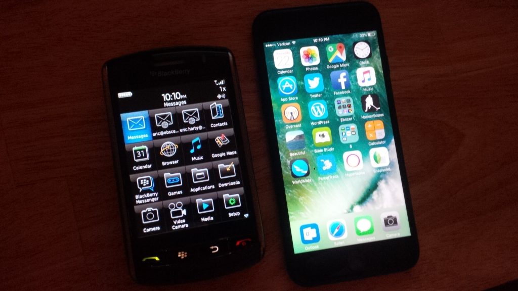
5 BlackBerry Storm features that the iPhone still lacks

With a higher resolution screen, a better camera, LTE support, and an OS that has been updated in the past eight years, the iPhone 7 is far superior to the BlackBerry Storm. Still there are a few things that the old phone still does better. With Apple releasing iOS 11 next month, lets hope that some of these features get included.

Unified Inbox

The BlackBerry Storm had a messages app that combined multiple email accounts, SMS, BBM, Twitter, and almost all other messaging platforms into a single feed. While not as complete as BlackBerry 10’s Hub, it was still superior to the siloed experience found on iOS. Attempts to address this issue on iOS with a notification center are not remotely useful.

A default email client that supports push for gmail accounts

The default email client for iOS is bad in many ways. However the lack of push support for the world’s most popular email service is particularly embarrassing. Third party clients support this, and BlackBerry has had this feature since well before the iPhone was ever launched.

Notification LED

One of BlackBerry’s simpler features was a small led that could be configured to blink different colors for different types of notifications. This allows you to know if you have any messages just a glance, and without even touching your phone. I am utterly baffled as to why other phone manufactures have not copied this feature.

An accessible file system

My iPhone has 128 GB of storage, yet I am unable to download email attachments simply because there is no place to just store arbitrary files. This could also be useful for transferring songs and pictures on and off from the phone. Apple’s attempt to hide complexity is actually making simple operations more complex.

A clickable screen that actually clicks

Honestly, neither the BlackBerry Storm’s click screen, nor the iPhone’s 3-D touch are good ideas. An interface that can work with a simple touch screen is a superior experience. But if you are going to have a clickable screen, you may as well commit to having a clickable screen. The 3-D touch feature on iOS is difficult to trigger intentionally, and in practice is more likely to trigger a long press event.