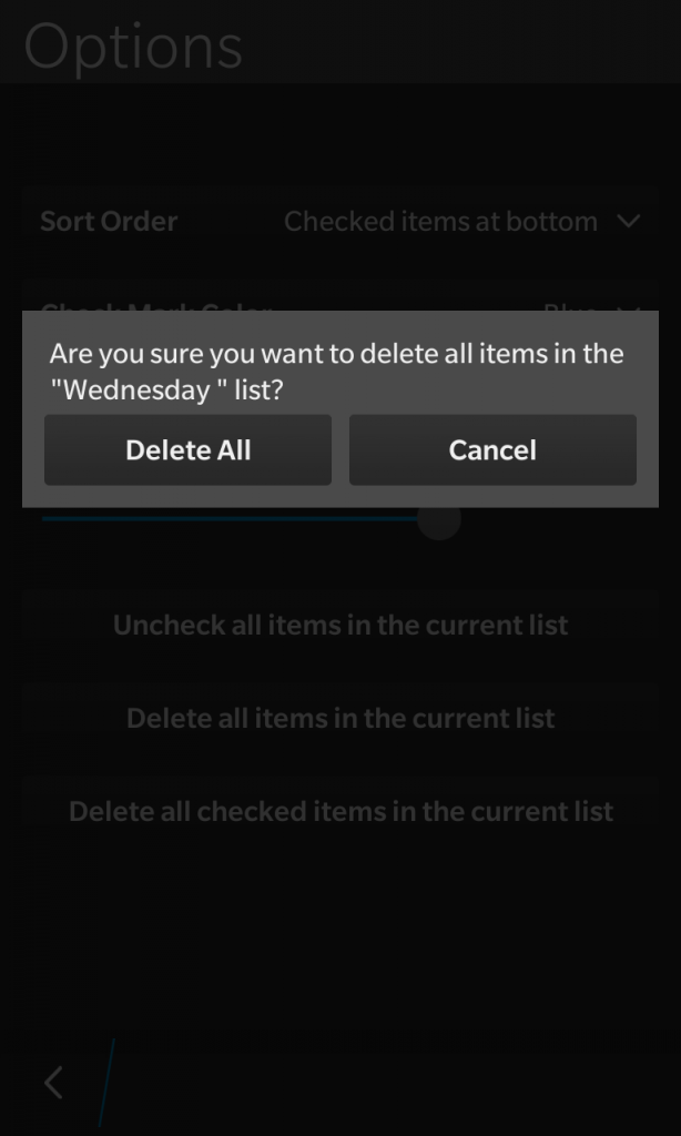
 When asking a question in an app, it is important to make it easy for the user to find the right answer to the question. Simply because a question is phrased for a yes/no answer doesn’t mean that presenting yes or no as answers is a good idea. Instead it is a good idea to present the answers such that the right option can be selected even if the user doesn’t even bother to read the question.
The Brexit ballot from earlier this month is an example of good design. The question on the ballet asked if the UK should leave the EU, but the answers to pick from are ‘remain’ and ‘leave’ rather than ‘yes’ and ‘no’. This makes for a better user experience.
The image to the right is from the Stuff I Need app and shows the example of the same design. ‘Delete All’ and ‘Cancel’ do not explicitly answer the question, but give the user the opportunity to pick the right choice, even if they don’t read the question.