 The UI that BlackBerry introduced on the PlayBook, and continued on BlackBerry 10 calls for the support of a swipe-down menu where a user can swipe down from the top bezel and gain access to additional options for the app. The design in very good in theory in that it allows a dedicated menu area without consuming any real estate on the screen or requiring a dedicated menu button. However, far too few apps make use of this menu for consumers to expect it to be there.
I have written about this problem before. Over two years ago I noticed this problem on the PlayBook and the issue has only gotten worse since then. The Cascades framework instead encourages the use of an overflow menu, and even less preinstalled apps make use of the swipe-down menu.
Major apps such as the Browser, Facebook, and the search app do not have a swipe-down menu at all. Many other first party apps such as the Pictures app, the Videos app, the Music app, and the File Manager make only trivial use of the swipe down menu offering nothing more than a link to an external help file. (Couldn’t BlackBerry at least open these help menus as a card?) Even more interesting is the Calculator app that had a swipe down menu when BlackBerry 10 first launched, but as of 10.1 no longer has one at all.
 Following BlackBerry’s lead, many developers (including myself) stopped using swipe-down menus. Following the current UI guidelines for Cascades almost every app will have some sort of an action bar making it trivial for developers to just place everything else in the overflow menu where it is much more discoverable by users. At this point I honestly can not recommend that anyone rely on the swipe-down menu as the only way to do anything in their app.
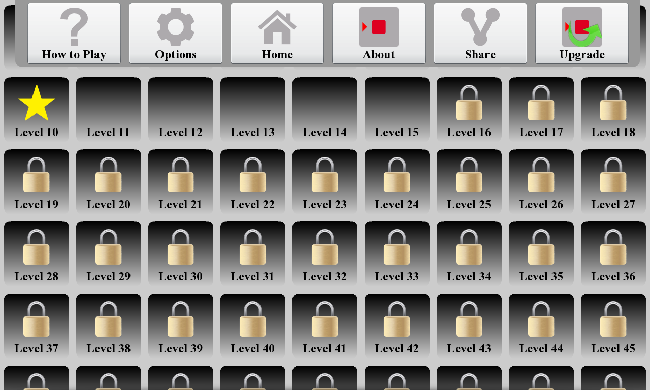
In version 5.1 of my Twinkle app (pictured) I am implementing a swipe-down menu in a Cascades app for the first time. Yet all three of the options there are redundant and are also available through the standard action bar overflow menu. At this time, this is the absolute most support that I am willing to give to the swipe-down menu. If BlackBerry wants this situation to change, they should seriously rethink their UI guidelines and what they are doing with their own apps…