With the rollout of BlackBerry 10.0.9 RIM is starting to show a different design to their UI that seems to take some cues from Microsoft’s Metro UI. This is most clearly seen on the icon screen, where all of the first party apps have gotten a very boxy look to them. Furthermore every app icon is placed in a square, even if the icon doesn’t plan for it. As with Microsoft’s Windows 8 the use of transparencies in icons is technically allowed, it just looks terrible (on both operating systems).
This squared off look goes even further into the design language of the apps. In cascades most of the native controls have a boxy feel to them (except for the parts that are blue), and contain very few curves on any of the UI elements. This design can easily be seen in the BBM app where the curved text bubbles on BlackBerry 7 have given way to right angles on BlackBerry 10.
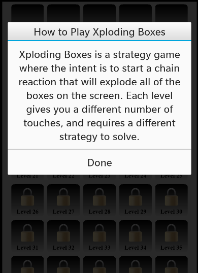
For example, the how to play dialog in Xploding Boxes uses the default alert dialog in order to display. While this presented a very curved and rounded UI on the PlayBook and BlackBerry 10.0.6 (first image), it has changed to a more boxed in look on the most recent BlackBerry 10.0.9 release (second image).

|
