From the start I’ve been placing the time in the title bar for most applications. This is because many people also use their phones as their primary time keeping device, and having the current time always on the screen makes this far more convenient. The code to do this has become much more optimized over time, but has remained being based upon placing a custom LabelField to the MainScreen setTitle() method.
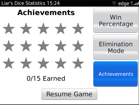
 However, with the release of OS6 the StandardTitleBar was added along with the Screen’s setTitleBar() method. This method is completely unrelated from MainScreen.setTitle(). In fact you can use both setTitle() and setTitleBar() on the same MainScreen without conflict (although it looks really bad). In addition to a title and the time the StandardTitleBar can also accommodate additional elements such as an icon, notifications, and signal information. The above image shows the StandardTitleBar with a title, the time, and signal information on the achievement screen of Liar’s Dice.
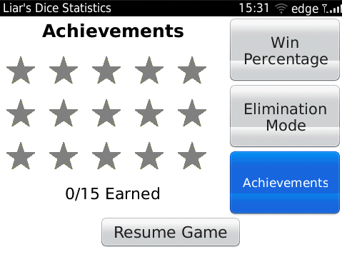
 By default the time is actually left justified right after the title, while the signal indicators are placed on the right edge. The goal was instead to move the time to the right like I have been doing with the setTitle() method. Fortunately due to the way that the title gets truncated, a simple way to do this is to just pad out the title with enough spaces. This is not the prettiest solution but it gets the job done, as seen in the second image which shows the final version of the achievement screen in Liar’s Dice.
Screen s = new Screen();

StandardTitleBar titleBar = new StandardTitleBar();

titleBar.addTitle("Liar's Dice                  ");

titleBar.addClock();

titleBar.addSignalIndicator();

s.setTitleBar(titleBar);